SEVERANCE
Letters of the seven deadly sins
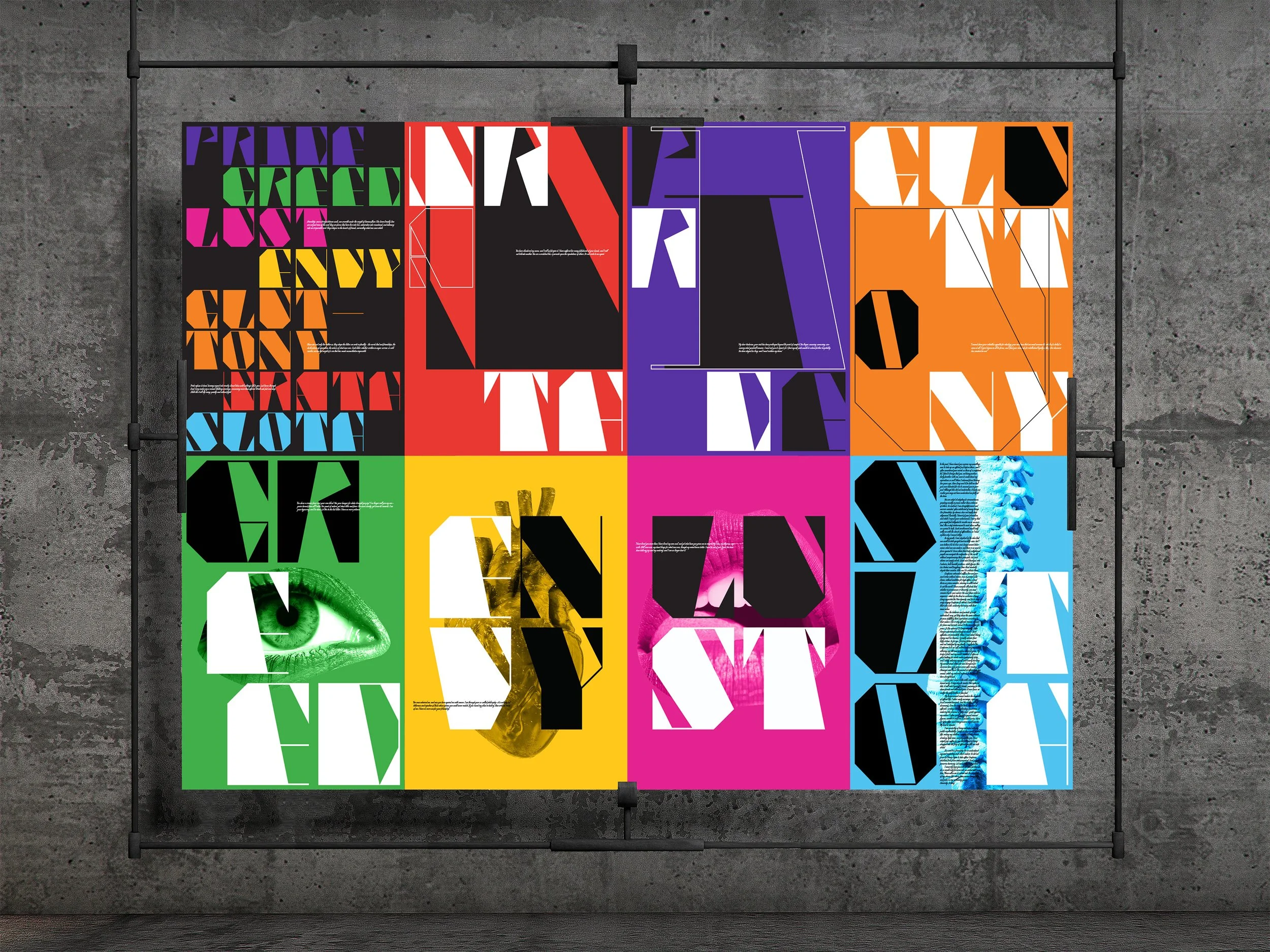
Severance is a typographic design project inspired by historical and contemporary “severance letters” exchanged between public figures across cultures. These ruptures, written at the end of relationships, are reframed through the lens of the seven deadly sins, positioning each conflict as a manifestation of pride, greed, lust, envy, gluttony, wrath, or sloth. The project translates these emotional turning points into a modular type system and a series of visual outputs, shifting the focus from the narrative content to the underlying patterns of human conflict.
Scope of work: Modular type design · typographic systems · narrative deconstruction · cross-media translation · spatial installation · textile fabrication
The project centers on a set of unfinished statements derived from breakup letters, where meaning is partial and resolution is absent. Instead of reconstructing full stories, the work isolates fragments of language that reflect tension, misalignment, and emotional residue.
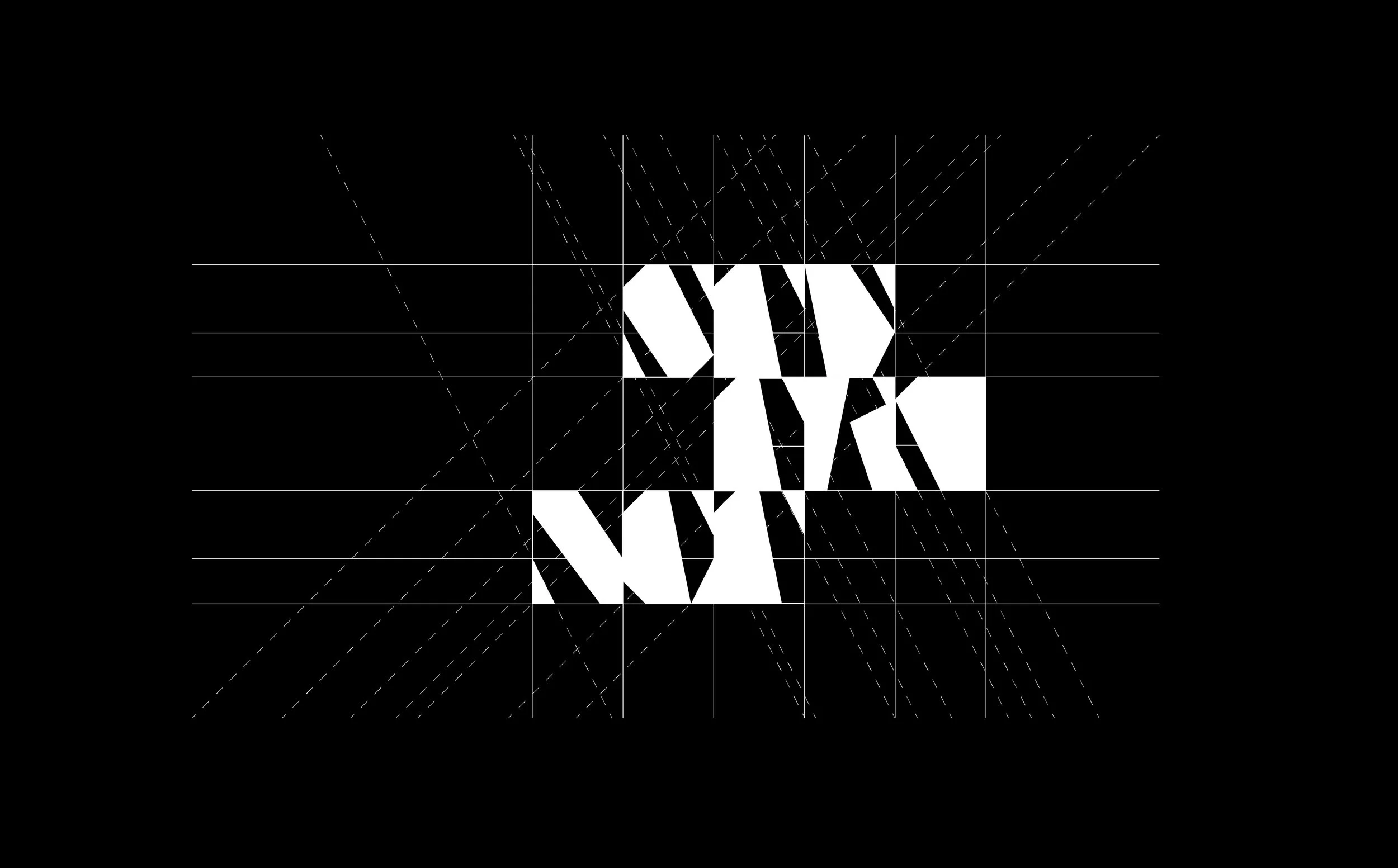
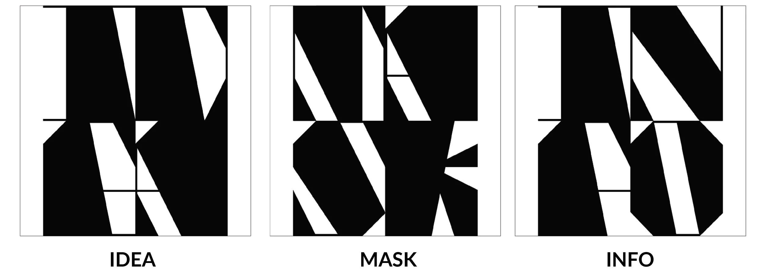
This approach informs a modular typeface system built through geometric construction. Letterforms are reduced into repeatable units and reassembled into variable structures, allowing controlled distortion and fragmentation. Each variation corresponds to one of the seven sins, translating abstract emotional triggers into formal differences in weight, balance, and structure. The result is a type system that encodes relational conflict directly into its form, shifting typography from neutral carrier to expressive system.
Typographic system

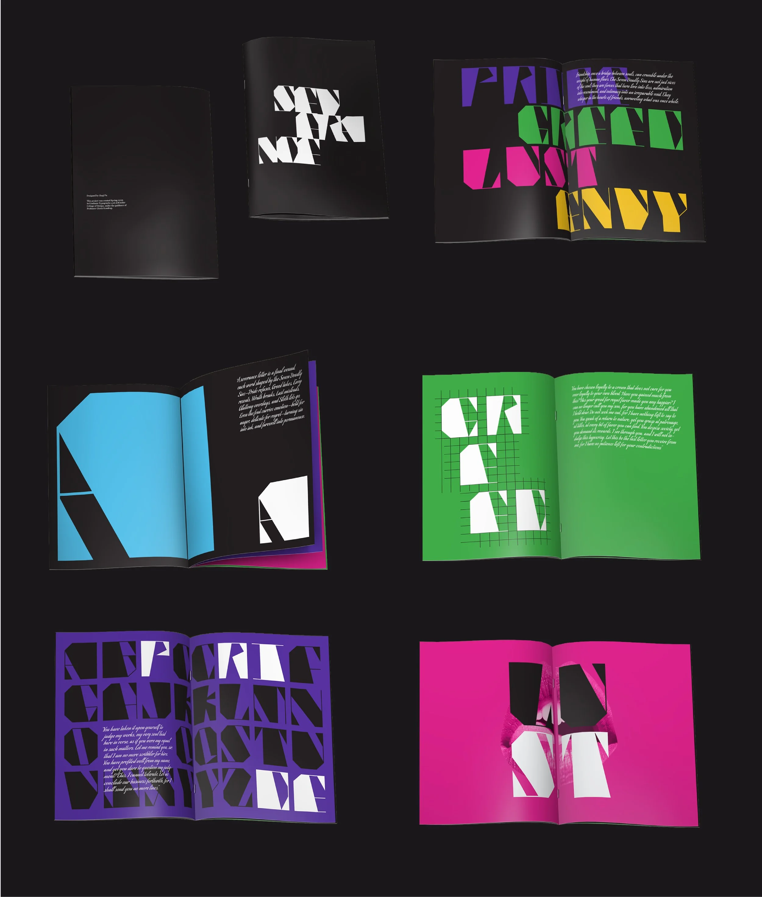
The process began with modular studies that broke letterforms into geometric components and tested how they behaved when scaled, rotated, or recombined. These studies established a flexible system capable of generating multiple typographic states while maintaining coherence. In parallel, each sin was paired with a symbolic object, which grounded emotional conditions in recognizable forms and extended the system beyond typography.
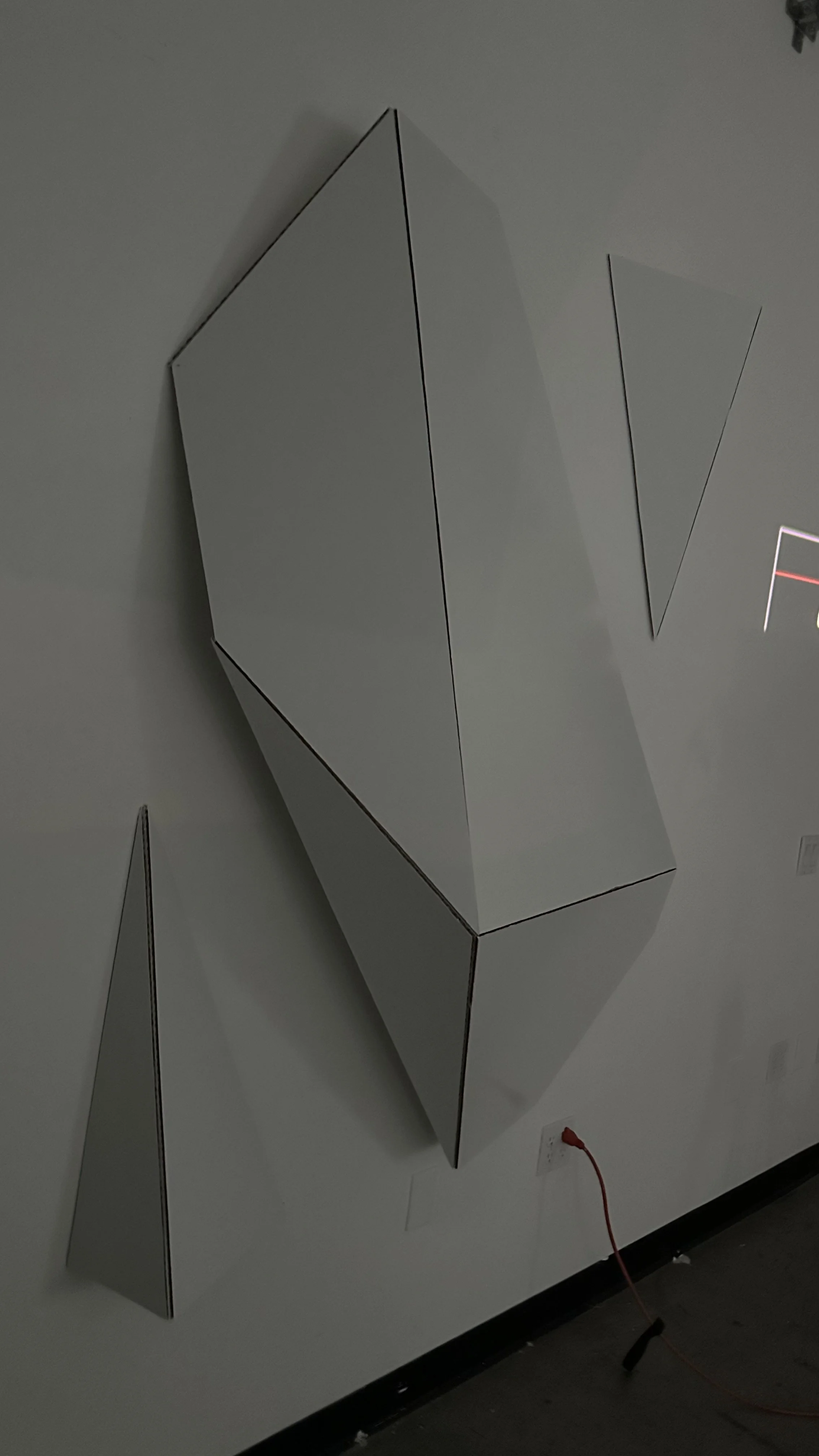
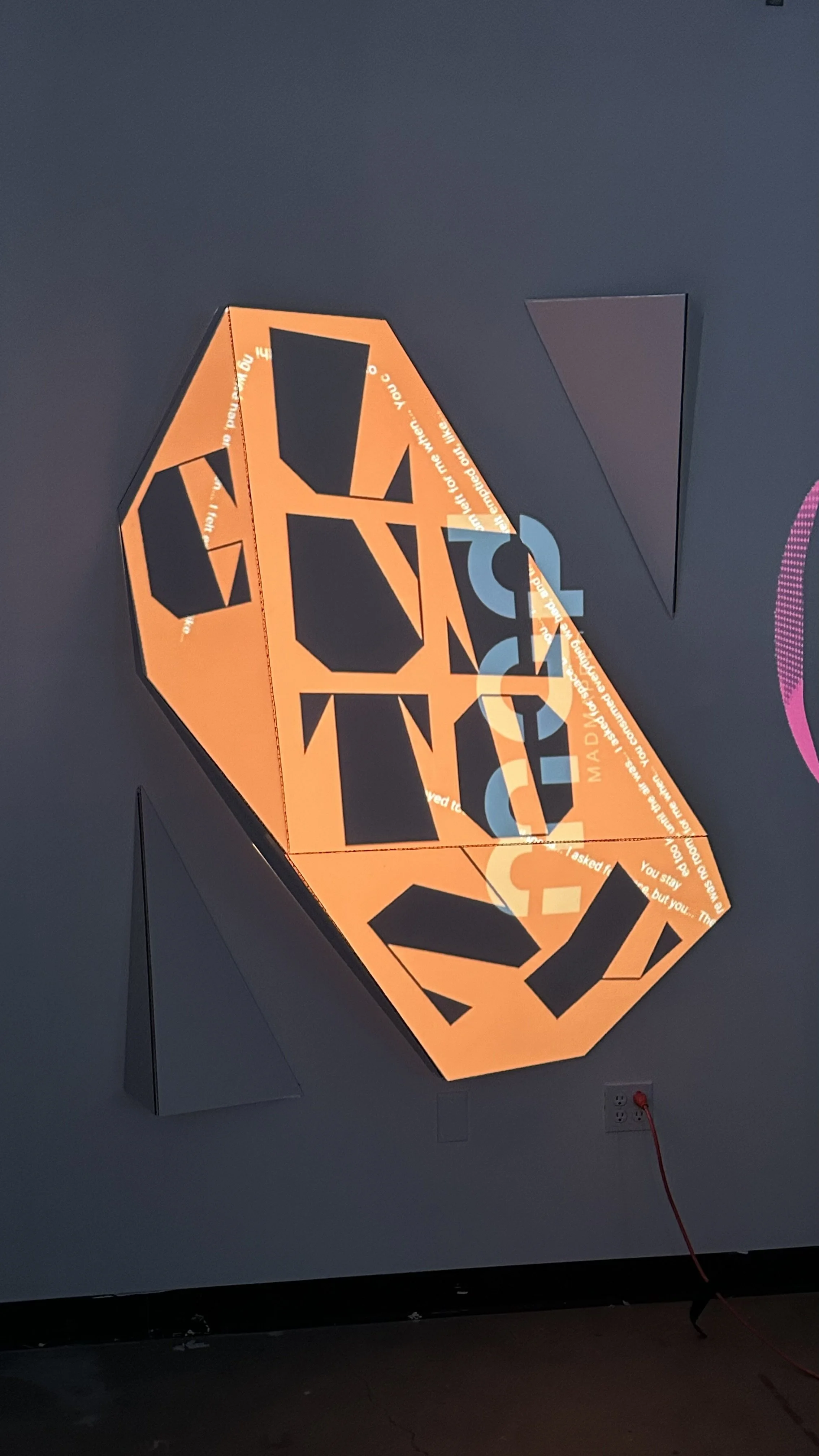
Visual language and spatial translation
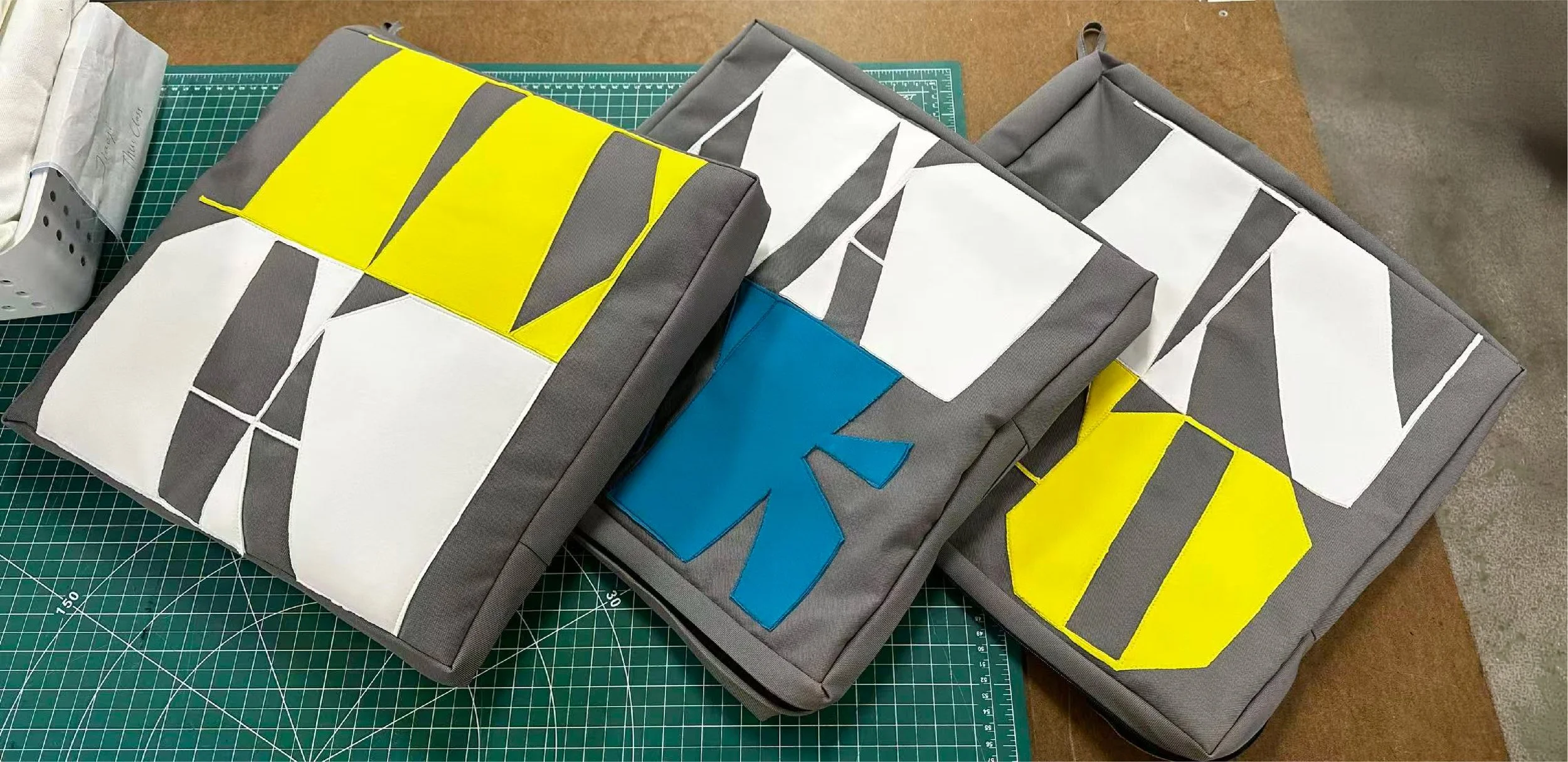
The visual language combines fragmented text with these symbolic references, emphasizing absence and disconnection rather than narrative clarity. This system was applied to posters and extended into a projection-based installation where typographic forms were translated into a faceted spatial structure. Projected content is distributed across these surfaces, requiring movement and shifting viewpoints to perceive the work. A series of hand-sewn cubic cushions translates the rigid typographic system into a soft, tactile format, creating a contrast between structural precision and physical intimacy.
The system is made into square cushions that are sewn on a sewing machine and by hand. Geometric letterforms become soft, tactile objects, the fabric panels are like typographic modules. This means that they keep the same structure, but the material properties change.
Cushion making